03 - Spread Of Wonder: The Robot and the Bluebird

Welcome to the third post in my ‘Spread Of Wonder’ series where I talk about spreads from picture books that I admire, I look at them and analyse why I think they make a good spread.  This month’s spread is the 10th spread of David Lucas’ “The Robot and the Bluebird” which was published in 2007 by Andersen Press.  


I do not know if David Lucas is a picture book superstar, but I personally, did not know of him until I recently came across this book in my local library.  It is a beautiful, whimsical story of an old, broken hearted robot who is put on the scrap heap but finds new purpose and friendship when he shelters a weak, migrating bluebird in the cavity where his heart used to be. It is illustrated with dip pen ink lines and coloured with watercolour, somewhat a traditional media in children's picture books.  


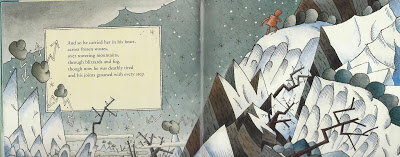
In this spread, the robot is at the hardest part of his journey, carrying the bird in his heart over a mountain.  He is moving left to right in direction, moving us through the story just as we have seen demonstrated in my previous choices of Spreads of Wonder.

What is great about this spread for me is how the illustration of the setting contributes to the storytelling.  The robot is crossing a mountain, a difficult thing to do at any time but even harder when it is raining and snowing like Lucas has drawn here.  Again Lucas uses direction in the diagonal lines of the falling rain and snow, pelting down against the robot's back.  Lucas has drawn grey thunder clouds that look like symbols from TV weather forecasts, with jagged arrowed, lightening coming from them, they are not soft and fluffy, they have hard outlines and their shading shows their solid form.  The mountains are also pointed and jagged, as are the trees with their icicle spikes and bare twig branches suggesting danger everywhere.

Lucas use uses a limited colour palette to great effect in this spread using only washes of blue, black and red against the white of the paper.  He uses the cool and muted blues, blacks and whites in the environment which contrasts starkly against the warm rust red of the robot.  Apart from the clouds, as already mentioned, and perhaps the robot, Lucas hasn't really used the colour to describe the form  of objects through shading, instead he applies colour as a bodycolour wash and uses the pen line to describe form.  This seems to be an often-used technique in children's picture book illustration and I wonder if it just adds to the clarity for children?    

What can the aspiring illustrator learn from this spread of wonder then?  This spread teaches us mainly about using illustration to contribute to storytelling. 

Storytelling - make the environment show the feelings of the story 
Direction - Use physical direction of the action to move the narrative forward, left to right and show hardship and struggle with right to left direction
Use Contrast of colour temperature to highlight a character.

Please comment with your own thoughts on this spread, or make a suggestion for a future Spread of Wonder candidate for me to analyse and don’t forget to follow this blog to receive a notification of my next post.  Thanks for reading! 

02 - Spread Of Wonder: Oh No, George!

This is the second post in my series ‘Spread Of Wonder’ where I talk about spreads from picture books that I admire, I look at them and analyse why I think they make a good spread.  This month’s spread is the 6th spread of Chris Haughton’s “Oh No, George!” which was published in 2013 (in paperback) by Walker Books.  

The cover of "Oh No, George!" by Chris Haughton
The minimal art in “Oh No, George!” could not be more different to the intricately detailed art in last month’s spread from “The House in the Night”.  The main reason that I have chosen it is its excellent demonstration of sequentiality.  If you have been reading my “Creating A Children’s Picture Book Illustration Portfolio” blog posts, you’ll know that being able to successfully show storytelling and characters in sequence is a requirement of picture book illustration and something I’m aiming to get better at. 

The story of “Oh No, George!” is about a dog who is left home alone and promises to be good but he just can’t help himself.  It is beautifully structured with a setup of things that could go wrong, followed by a pause with the 'What will George do?' question, then the page turn reveals the results of George’s actions alongside the 'Oh no, George!' refrain. 

In this Spread of Wonder where George sees Cat, we see three depictions of George across the spread, two on the verso (lefthand) page and one on the recto (righthand) page.  And just like in "The House in the Night" spread last month, the direction of George’s actions are moving us forward left to right, through the story with him either moving to or looking towards the right.  


The spread has a white background with some minimal lines suggesting the location of the last spread; the floor and some remains of cake.  Haughton uses a flat, cutout style with bold colour and strong silhouettes, this is accentuated by him using no outlines (apart from on George’s eyes).  Like most artists working in a flat style he does not use light and shade to model the shadow of three-dimensional form but his colouring is far from flat.  George is red but he has a slightly lighter underside and a purple nose and there is always a pencil scribble somewhere on him.  I think the colouring is digital and rather than using Adobe Photoshop’s gradient feature I think Haughton has used the cutout technique for colouring too, as we see the straight edges where the colour subtly changes.

As I have already stated I have chosen this spread because it excels at sequentiality both within the spread itself and in context of the whole book.  This spread comes after George has eaten the cake that he shouldn’t have and before he chases Cat. The previous and following spreads show George’s chaos in full colour backgrounds which contrast with our spread which has a white background.  Unlike comics, picture books don’t often use panels to show sequence.  George is shown in differing sizes on the white background and this change in scale somehow visually signals to us that is a sequence and not three different dogs.  George is drawn consistently regardless of his different poses, he doesn’t change colour and his proportions don’t change, this also confirms that we are looking at a sequence of the same dog. 

Previous Spread


Following Spread
What can the aspiring illustrator learn from this spread of wonder then?  This spread teaches us a lot about Sequentiality and some of the elements that go into it: 
  • Show Contrast - in pose, size and mood when depicting a character in sequence 
  • Be Consistent - keep your characters and settings ‘on model’, don't change proportions, colours, etc. 
  • Establish a Rhythm - Haughton's example is a setup, a pause and the following results

Please comment with your own thoughts on this spread, or make a suggestion for a future Spread of Wonder candidate for me to analyse and don’t forget to follow this blog to receive a notification of my next post.  Thanks for reading!


01 - Spread Of Wonder: House In The Night

This post marks the first in a monthly series! I’m calling this series Spread Of Wonder and I’m going to talk about spreads* from picture books that I admire because it will be nice to share with you and because it will help me in my quest to become a Children’s Picture Book Author and Illustrator.  You can’t make picture books without reading them and really looking at them so this series will help me do that and analyse what makes a good spread.

 * - two facing pages of a book, see my Anatomy of a Picture Book video if you need more clarification

The first spread that I am looking at is the 8th spread; “all about the starry dark.” from the gorgeous, Caldecott-winning “House In The Night” written by Susan Marie Swanson and illustrated by Beth Krommes.  The copy I have is a board book that was published in 2011 by Houghton Mifflin Harcourt in the UK and I bought it from the Seven Stories bookshop where it just jumped off the shelves as being so striking.

The House in The Night - Spread of Wonder

The story, on its simplest level, is about a girl going home to her bed, reading a book and going to sleep as night falls.  It is so much more poetic than that, with beautiful language.  The girl is shown as reading the same book as we are, but for her the bird in the book comes to life and carries her through the night.  In fact that is what this spread shows.  In the top right corner we see the girl riding the bird as it spreads a blanket of darkness over the land.

As the book is about dark and light, day and night, what better way to show this with the bold black and white scraperboard technique, picked out accents of yellow?  Where Krommes needs tone, she makes lots of little marks. The closer the marks are together, the lighter the tone.  

Detail of The House in The Night - Spread of Wonder

I know from experience how difficult it is to work in scratchboard, not only physically in making tiring, little scrapes in the inked clay surface but mentally in how you have to draw in reverse, scraping the highlights of an object onto black.  It is also hard to repair the surface if you make a mistake and it is a nightmare to reproduce with lots of postproduction required.

 "This Crooked Way" Scratchboard by Claire O'Brien
"This Crooked Way" Scraperboard by Claire O'Brien

Formally, Krommes has flattened the perspective of the landscape, describing the hills as overlapping semi-circles.  The roads curve slightly over the hills to describe their 3D form.  She disregards diminution, things only get slightly smaller, the further away in the scene that they are.  This is a clever device as it makes the image full of detail for a child to immerse themselves in.  The blanket of dark is drawn over the landscape with an undulating outline and creates a beautiful contrast with the light ahead of it.  In the dark, the stars, house lights and car lights are picked out in yellow and in the light ahead, the yellow also accents the bird’s song, a washing line, car, roof, flowers and a sign.

How does this spread aid storytelling?  The direction of the bird is moving from the left to the right which is the norm for Western, linear story telling, so the spread moves us forward in the story.  If we look at the preceding spread we see that it follows a close, dynamic shot of the bird and girl flying out of the window, which shows a clear change in location and makes them two very different spreads. This is unlike the following spread, where, although seen from a different angle, the bird is practically in the same position, same size and same location as it was before.

The House in the Night - Preceding and Following spreads.


What can the aspiring illustrator learn from this spread of wonder then? 
  • The physical Direction of the action contributes to the narrative of the story
  • Perspective - simplification and lack of diminution aids creating detail
  • Limited Palette - The black, white and yellow are very striking

You can see Krommes’ working method here and read Carter Higgins’ feature on the book in her Design of the Picture Book blog

There is just so much for a child to look at and for an adult to admire in this beautiful book.  Please comment with your own thoughts on this spread, or make a suggestion for a future Spread of Wonder candidate for me to analyse and don’t forget to follow this blog to receive a notification of my next post.  Thanks for reading!