01 - Spread Of Wonder: House In The Night

This post marks the first in a monthly series! I’m calling this series Spread Of Wonder and I’m going to talk about spreads* from picture books that I admire because it will be nice to share with you and because it will help me in my quest to become a Children’s Picture Book Author and Illustrator.  You can’t make picture books without reading them and really looking at them so this series will help me do that and analyse what makes a good spread.

 * - two facing pages of a book, see my Anatomy of a Picture Book video if you need more clarification

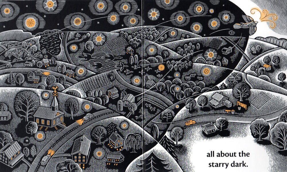
The first spread that I am looking at is the 8th spread; “all about the starry dark.” from the gorgeous, Caldecott-winning “House In The Night” written by Susan Marie Swanson and illustrated by Beth Krommes.  The copy I have is a board book that was published in 2011 by Houghton Mifflin Harcourt in the UK and I bought it from the Seven Stories bookshop where it just jumped off the shelves as being so striking.

The House in The Night - Spread of Wonder

The story, on its simplest level, is about a girl going home to her bed, reading a book and going to sleep as night falls.  It is so much more poetic than that, with beautiful language.  The girl is shown as reading the same book as we are, but for her the bird in the book comes to life and carries her through the night.  In fact that is what this spread shows.  In the top right corner we see the girl riding the bird as it spreads a blanket of darkness over the land.

As the book is about dark and light, day and night, what better way to show this with the bold black and white scraperboard technique, picked out accents of yellow?  Where Krommes needs tone, she makes lots of little marks. The closer the marks are together, the lighter the tone.  

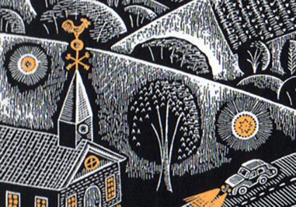
Detail of The House in The Night - Spread of Wonder

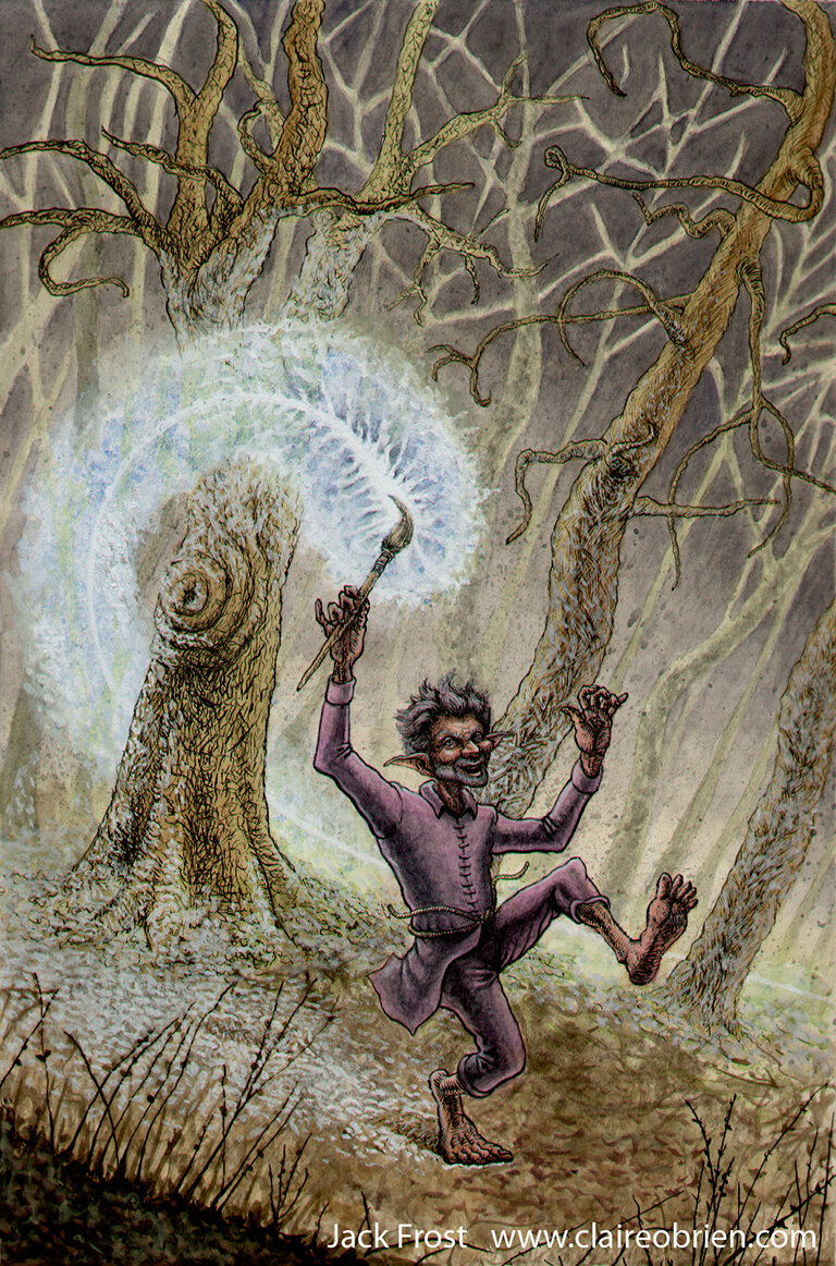
I know from experience how difficult it is to work in scratchboard, not only physically in making tiring, little scrapes in the inked clay surface but mentally in how you have to draw in reverse, scraping the highlights of an object onto black.  It is also hard to repair the surface if you make a mistake and it is a nightmare to reproduce with lots of postproduction required.

 "This Crooked Way" Scratchboard by Claire O'Brien
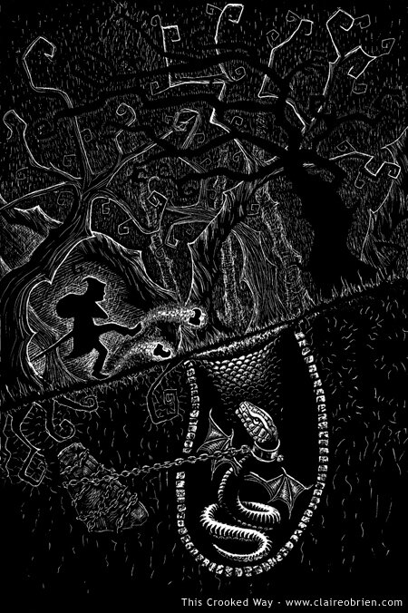
"This Crooked Way" Scraperboard by Claire O'Brien

Formally, Krommes has flattened the perspective of the landscape, describing the hills as overlapping semi-circles.  The roads curve slightly over the hills to describe their 3D form.  She disregards diminution, things only get slightly smaller, the further away in the scene that they are.  This is a clever device as it makes the image full of detail for a child to immerse themselves in.  The blanket of dark is drawn over the landscape with an undulating outline and creates a beautiful contrast with the light ahead of it.  In the dark, the stars, house lights and car lights are picked out in yellow and in the light ahead, the yellow also accents the bird’s song, a washing line, car, roof, flowers and a sign.

How does this spread aid storytelling?  The direction of the bird is moving from the left to the right which is the norm for Western, linear story telling, so the spread moves us forward in the story.  If we look at the preceding spread we see that it follows a close, dynamic shot of the bird and girl flying out of the window, which shows a clear change in location and makes them two very different spreads. This is unlike the following spread, where, although seen from a different angle, the bird is practically in the same position, same size and same location as it was before.

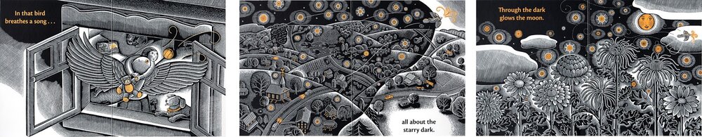
The House in the Night - Preceding and Following spreads.


What can the aspiring illustrator learn from this spread of wonder then? 
  • The physical Direction of the action contributes to the narrative of the story
  • Perspective - simplification and lack of diminution aids creating detail
  • Limited Palette - The black, white and yellow are very striking

You can see Krommes’ working method here and read Carter Higgins’ feature on the book in her Design of the Picture Book blog

There is just so much for a child to look at and for an adult to admire in this beautiful book.  Please comment with your own thoughts on this spread, or make a suggestion for a future Spread of Wonder candidate for me to analyse and don’t forget to follow this blog to receive a notification of my next post.  Thanks for reading!

Creating A Children’s Picture Book Illustration Portfolio - Format and Content - What to Put In? - Part 2

In my first post on the subject of Creating A Children’s Picture Book Illustration Portfolio I talked about the quantity and quality of the images.  In this post I’d like to explore format and content, by that I mean what the actual images show and how they are presented.  I will use my findings to create action points for me to apply to my own portfolio as it presently stands.

The Format of Children’s Picture Book Illustrations
Based on my observation of current children’s picture books, illustrations destined for the printed page are mostly printed in landscape format, spanning double page spreads.  In the past we saw more of single spread images and spot images and these are useful if you need more than the allocated 32 pages to tell the story.  

The Content of Children’s Picture Book Illustrations
Illustrations in children’s picture books are sequential in that they have multiple images that tell a story that happens over time.  This means that there is a requirement to be consistent in their execution, characters have to be ‘on model’, that is they have to have the same proportions and features and wear the same clothes from page to page (unless the story dictates otherwise).  Colours have to match from image to image.  Locations and props also need to be consistent in the same way.  Sequential storytelling art by its nature shows characters doing lots of actions and having different emotions and feelings.  And again, unless the story demands it, the art is produced in a consistent same style and medium. 

Appraising the Format and Content of the Work in My Own Portfolio
Okay, here is what my portfolio currently looks like, as whole, as seen on my website:

Claire O'Brien Art Portfolio

Disregarding its quality, I have a minimum desired quantity of six illustrations, of mainly human subjects, painted traditionally with gouache on paper.  I also have a digital piece, an ink and watercolour and a scraperboard.  

Venice Children's Picture Book Art Claire O'Brien


This is a tonal gouache sketch of a spread from one of my picture books that I am working on.  I think it is the strongest piece of work in my portfolio as it is has storytelling and is in a complete setting that conveys mood and atmosphere.  This has been affirmed to me by its selection in the 2014 SCBWI (British Isles) Showcase Exhibition a goal that I expressed a wish to achieve back in July when I helped to hang the 2013 Showcase at Seven Stories.

Children's Picture Book Art Claire O'Brien


Baby Bouncer is painted in gouache with a touch of digital, set in an interior setting, it hopefully shows consistency in depicting a character and is sequential showing different emotions and action.

Claire O'Brien Art


When Mum Came Back is a gouache showing a group in exaggerated action, with different emotions.

Children's Picture Book Art Claire O'Brien


Outdoor Girl and Sidekick is me trying to capture my gouache style digitally.  I like the characters but I'm not sure of their emotions here, they're perhaps a bit neutral.

Jack Frost Art Claire O'Brien


Jack Frost is painted with ink and watecolour and is me attempting to draw like Arthur Rackham. Things in favour of this illustration are that is set in a forest setting and I like the rendering of the body.  The storytelling not quite there and the aesthetic is perhaps more fantasy than picture book. 

Art Claire O'Brien


This Crooked Way is a scraperboard and I like the design style dictated by the medium, but it would need refining if I were to do more of these.   Again perhaps the aesthetic is more fantasy than picture book.

Action Points
So here are my conclusions about the format and content of my children's picture book illustration portfolio and some suggested action points to implement in order to improve it, who knows they may apply to your own portfolio:
  • Produce future work in landscape format.
  • Produce consistent looking sequential images that show characters doing different actions and showing different emotions.
  • Include more settings/backgrounds (move away from white backgrounds)

Further Reading
Here are some good links to what others have to say about children's picture book illustration portfolios:
  • Lynne Chapman's professional view on character and characterisation
  • Donald Wu gives his professional opinion for ordering your portfolio and good advice on style and content.
  • Eliza Wheeler shares her SCBWI feedback on improving her portfolio.